
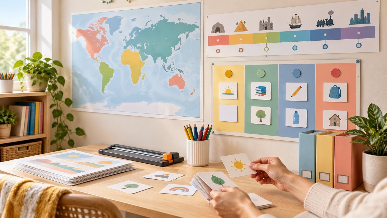
The homeschool wall charts worth printing large are the ones your family will consult repeatedly from several feet away. A frequently used map, broad history timeline, daily schedule, routine sequence, or compact reference chart can justify the paper, ink, and wall space. A chart used for one lesson, filled with small details, or meant to be read at arm’s length usually belongs in a binder instead.
Size alone does not make a printable useful. Large charts work when the content has a clear job, the important information remains readable at the intended distance, and the chart is placed where that job happens. Before ordering a poster or assembling tiled pages, decide who will use it, from where, and how often.
Use a simple test before printing anything large
A wall-sized print should earn its space. Ask these questions before choosing a finished size:
- Will someone look at this at least weekly, or is it tied to a short unit?
- Does the learner need an overview, a sequence, or a quick reminder rather than dense explanation?
- Will it be viewed from a desk, across a room, or while standing beside it?
- Can the essential words, numbers, and symbols remain large after printing?
- Does the information change often enough that a replaceable or movable format would be better?
- Is there an uncluttered place to hang it near the activity it supports?
Repeated use is usually the strongest reason to go large. A multiplication reference used throughout the year has a better claim on wall space than a detailed diagram needed for three days. Likewise, a routine chart beside the work area can be more useful than a beautiful schedule posted where nobody performs the routine.
Vanderbilt University’s IRIS Center guidance on visual supports recommends matching a support’s placement and form to its use, including putting visual directions where the task occurs and positioning materials for young children at eye level. It also emphasizes that visual supports should be explicitly taught rather than merely displayed.
Which homeschool charts are worth enlarging?
| Chart type | Usually worth printing large when | Keep it smaller when |
|---|---|---|
| Maps | You refer to locations across multiple lessons and need a shared geographic overview | The map contains dense labels, specialized data, or details examined individually |
| Timelines | The goal is to show broad sequence, overlap, or historical scale over a semester or year | It covers one short unit or requires long event descriptions |
| Daily schedules | Several people need to see the day’s sequence quickly | The schedule changes constantly or contains private appointments |
| Routine charts | The chart supports a repeated sequence in the place where it happens | The learner already completes the routine independently |
| Reference charts | A small set of facts, symbols, or steps is used frequently | The content is dense, subject-specific, or needed only during one assignment |
| Visual aids | A diagram or process must be discussed by more than one person at once | Fine detail matters more than the overall structure |
Maps: enlarge the overview, not every label
Maps are strong candidates for large-format printing because they help learners connect individual places to a broader spatial picture. A world map, national map, regional map, or physical-features map can support repeated reference across geography, history, literature, science, and current-events work.
The best wall map is not necessarily the one with the most information. Excess roads, boundary labels, place names, symbols, and decorative layers can compete with the feature you want a learner to notice. USGS guidance warns that excessive reproduced detail can impair map legibility, while its printing instructions recommend removing unnecessary layers when they make the printed map difficult to read.
Choose the map according to its main task. A map for locating continents should have bold landforms and restrained labels. A state-capitals map needs readable names and clear boundaries. A topographic map may require much finer detail and is often better studied close up rather than treated as room decoration.
When scale matters, do not casually enlarge, shrink, or select “fit to page.” The USGS full-scale map printing guidance advises printing map PDFs at 100% when accurate scale is required because a PDF can preserve vector information and the intended dimensions. For an ordinary reference map where exact scale is not part of the lesson, resizing is reasonable, but inspect the labels at the final physical size before committing to a large print.
Timelines: choose a readable span and hierarchy
A large timeline earns its place when it helps learners see sequence and relationships that are awkward to understand on separate worksheets. It can show that civilizations overlapped, place literature beside historical events, or connect discoveries across subjects.
Do not turn the wall into a textbook page. Give dates and major periods the largest type, use shorter labels for events, and reserve paragraphs for a notebook or companion sheet. If every event seems equally important, the timeline needs editing before it needs enlarging.
Long horizontal timelines work best where there is an uninterrupted wall. When that is unavailable, divide the content into clearly labeled eras or centuries rather than winding a single line around corners. Keep the scale consistent within each section, and add a visible continuation marker so the sequence remains understandable.
Consider a modular timeline if lessons will add people, inventions, books, or pictures throughout the year. Print the time scale once, then attach removable event cards. A pocket-chart format can also accommodate cards that need frequent rearrangement without requiring a complete reprint.
Schedules and routines: prioritize changeability
Schedules are useful at wall size when several family members need a quick view of what happens next. Keep the permanent structure simple: broad time blocks, subject categories, or a short sequence. Use movable cards, reusable writing areas, or replaceable inserts for details that change from day to day.
Visual schedules can cover a few activities or a whole day and may combine objects, photographs, symbols, and words. The appropriate form depends on the learner, so a text-heavy planner should not automatically become the household schedule. Familiar pictures or simple line drawings can be paired with text when that makes the sequence easier for a child to interpret.
A routine chart should live beside the routine whenever practical: a morning checklist near the getting-ready area, a school-start sequence by the workspace, or a cleanup sequence near the supply shelves. Predictable events, clear procedures, modeling, and rehearsal are more important than an elaborate design. Guidance from the Institute of Education Sciences on positive home routines recommends defining, demonstrating, practicing, and refining expectations.
Introduce the chart directly. Walk through each symbol or step, model the sequence, practice using it, and check periodically that it still makes sense. A wall chart is a prompt and reference, not a substitute for teaching the routine.
Reference charts: print only the part needed at a glance
Reference charts deserve large treatment when they answer recurring, predictable questions. Examples include a number line, place-value chart, multiplication grid, measurement relationships, handwriting model, punctuation reminder, color wheel, or compact scientific classification.
The common mistake is combining too much. A multiplication chart does not need several paragraphs about multiplication. A punctuation chart does not need every uncommon usage case. Put the core reference on the wall and keep worked examples or detailed rules in a binder.
Before enlarging a worksheet into a poster, simplify it. Remove answer boxes, decorative borders, extended directions, and anything designed for close-range writing. Preserve strong contrast, generous spacing, and a clear visual hierarchy. If the chart still requires a learner to stand inches away and search through tiny print, it is functioning as a handout and should be printed accordingly.
Match type size to the real viewing distance
A poster that looks clear on a laptop can become surprisingly difficult to read on a wall. Test the design at its intended distance instead of relying only on the font-size number shown in the design software.
The U.S. Access Board’s guidance on sign character height and contrast is written for accessible signs rather than homeschool posters, but it illustrates the underlying relationship: greater viewing distance requires larger characters. Its guidance also identifies contrast and non-glare finishes as important readability factors.
Use that principle as a design check, not as a claim that a home learning chart must follow signage specifications. Print a sample containing the smallest important text at actual size. Tape it to the wall, step back to the learner’s normal position, and check it under the room’s usual lighting. If it cannot be read comfortably, enlarge the text or remove content.
Avoid solving a readability problem by enlarging the entire file without editing it. Bigger paper does not correct weak contrast, crowded lines, long text blocks, or a confusing hierarchy. National Park Service guidance similarly identifies viewing distance, lighting, spacing, contrast, color, and line length as interacting parts of legibility.
Choose a production method that fits the chart
For a small wall chart viewed near a desk, 11-by-17-inch printing may be enough. Medium posters around 18 by 24 inches can provide more room for a map, schedule, or reference chart without dominating a modest learning area. Longer timelines may need a custom strip or a series of matching panels rather than one oversized sheet.
A home printer is practical for replaceable charts, short-term units, and tiled posters. It also makes it easy to revise a routine or correct a label. Expect to spend preparation time trimming margins, aligning sheets, and joining panels. Build a little overlap into tiled designs so small trimming differences do not create visible gaps.
Professional large-format production becomes more attractive when the chart has heavy ink coverage, must appear as one seamless sheet, will remain in use for a long period, or would consume many tiled pages. Before ordering, inspect the file at its final dimensions and confirm that images, labels, and thin lines remain clear. Printing a low-detail source file on a larger sheet only produces larger flaws.
Paper selection should follow the chart’s job. Ordinary paper is inexpensive for temporary displays. Heavier paper is easier to handle when a chart will be moved or reused, although the printer must support it. For tiled posters, moderate-weight paper is often easier to align than stiff cardstock. If you are comparing paper characteristics for home production, the guide to worksheet paper weight, brightness, and opacity explains how those properties affect printing and handling.
Laminate selectively rather than automatically
Lamination can make a working chart easier to wipe and can add stiffness, but it also adds cost, bulk, and glare. It makes the most sense for frequently handled routine cards, reusable writing areas, charts near messy activities, or pieces that move in and out of pockets.
A chart that simply hangs on a wall may not need plastic film. A matte poster surface, protective frame, or replaceable copy can be easier to read under strong lighting. If you do laminate, test the finished surface from the side as well as straight on; reflected light can hide text even when the print itself has good contrast.
Do not laminate a valuable original or a paper item intended for preservation. The Library of Congress preservation guidance notes that lamination can permanently and irreversibly affect paper objects. It also warns that long-term light exposure can cause paper to fade, discolor, and become brittle. Use a reproduction for the wall and keep important originals stored appropriately.
Plan the wall as a working space
Too many large charts can make each one harder to find. Reserve the most visible area for materials used now, and rotate unit-specific displays when the topic changes. Permanent references can occupy a consistent secondary area so learners know where to look.
Group charts by function rather than filling every open patch of wall. Keep the daily schedule and routines together, place math references near the math workspace, and give maps or timelines enough surrounding space to be viewed without visual competition. Mount frequently consulted material at a practical eye level for its main user.
Store retired charts flat or loosely rolled, with a clear label showing the subject and level. Save the final print file with its dimensions and revision date in the filename. That small step prevents accidental reprints from an outdated version and makes it easier to replace one damaged panel instead of reconstructing the entire project.
A practical printing workflow
- Define the chart’s single main job and expected period of use.
- Measure the available wall area and estimate the normal viewing distance.
- Remove details that do not support the chart’s main job.
- Set the major heading, labels, and symbols in a clear hierarchy.
- Print the smallest important text at actual size and test it from the intended location.
- Choose a finished size and decide between home tiling and one-piece professional printing.
- Select paper and protection based on handling, lighting, and replacement cost.
- Teach the learner how to use the chart, then remove or revise it when it stops being useful.
Spend wall space on repeated usefulness
For most homeschool spaces, the best large prints are a frequently referenced map, a broad timeline, a visible but changeable schedule, one or two routine sequences, and a small set of genuinely useful subject references. Everything else should compete for the wall based on repeated use, not decorative appeal.
Start with one chart and observe whether anyone actually consults it. If it supports the work, print the next one. If it becomes background scenery, revise its placement or format—or return that information to a binder. A successful homeschool wall chart is not merely large. It is readable, purposeful, easy to maintain, and available exactly where the learner needs it.
References
- Page 6: The Learning Environment
- How do I get a full-scale plot of a USGS topographic map? | U.S. Geological Survey
- Topographic Mapping | U.S. Geological Survey
- Early Childhood Behavior Management
- Supporting Positive At-Home Behaviors Among Elementary Students | IES
- Practical Resources to Support Early Learners' Transitions to School | IES
- Chapter 7: Signs
- www.nps.gov
- Content Recommendations – Time Capsules: Tips on Preserving the Contents – Research Guides at Library of Congress